Nicholl Oils Re-brand
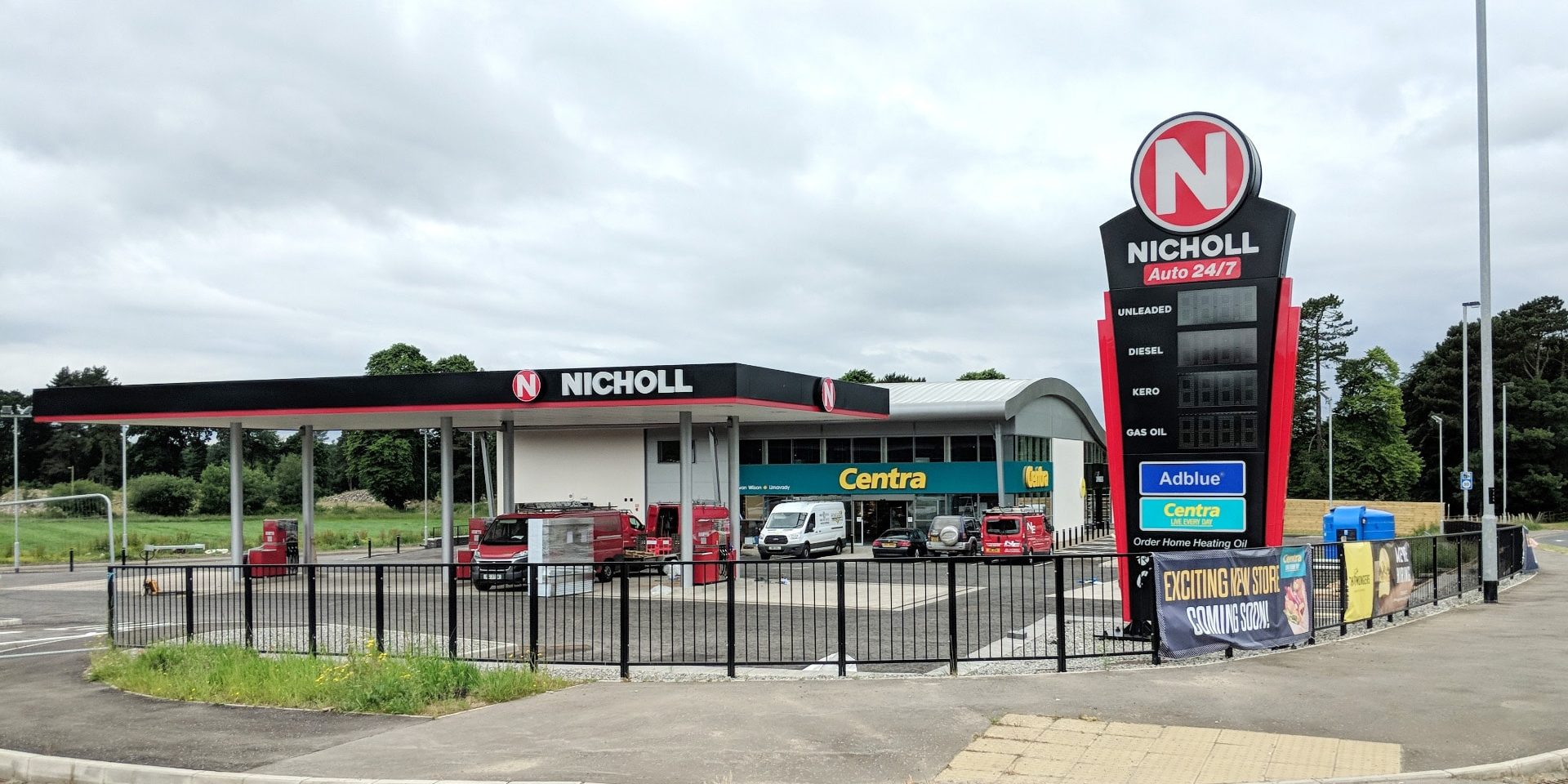
Recently we carried out the works for a brand new Nicholl oils fuel garage in Limavady. With experience spanning 50 years the Nicholl brand were looking to expand furthermore. They approached us to help them with their need for top quality signage, and that is exactly what we provided.

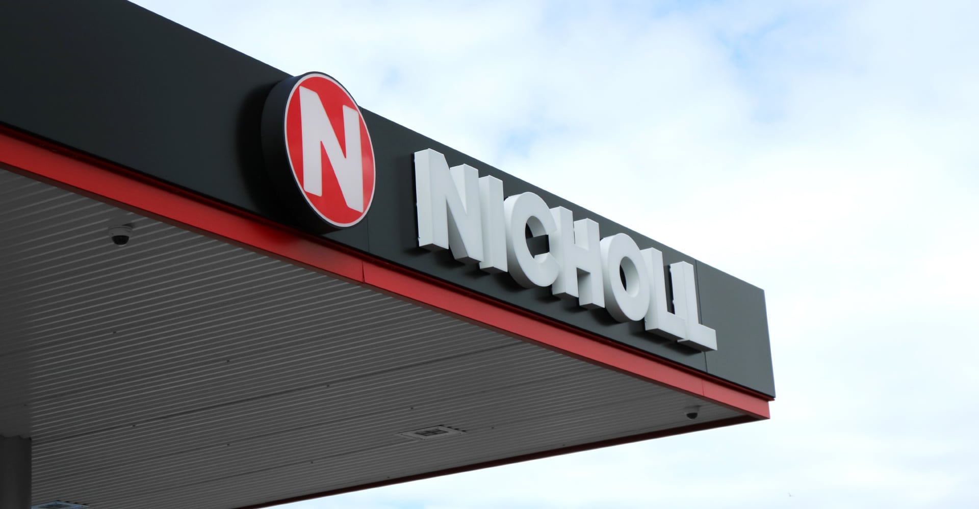
Creating attention-grabbing signage is a crucial step towards successful signage. We were asked to create new branding, whilst keeping the Nicholl Oils colours of red, white and black. Updating the branding for Nicholls was a way for us to show the positive impact modernising a logo can have. The letter N is a prominent feature in the logo. We kept this component to help the target audience associate the new logo with the older logo. We felt it was key to make sure not to stray too far from the familiarity of original branding. To make the N stand out we placed it within a red circle with a white and black stroke to add definition. The Nicholl letters are uppercase bold in a sans serif typeface.

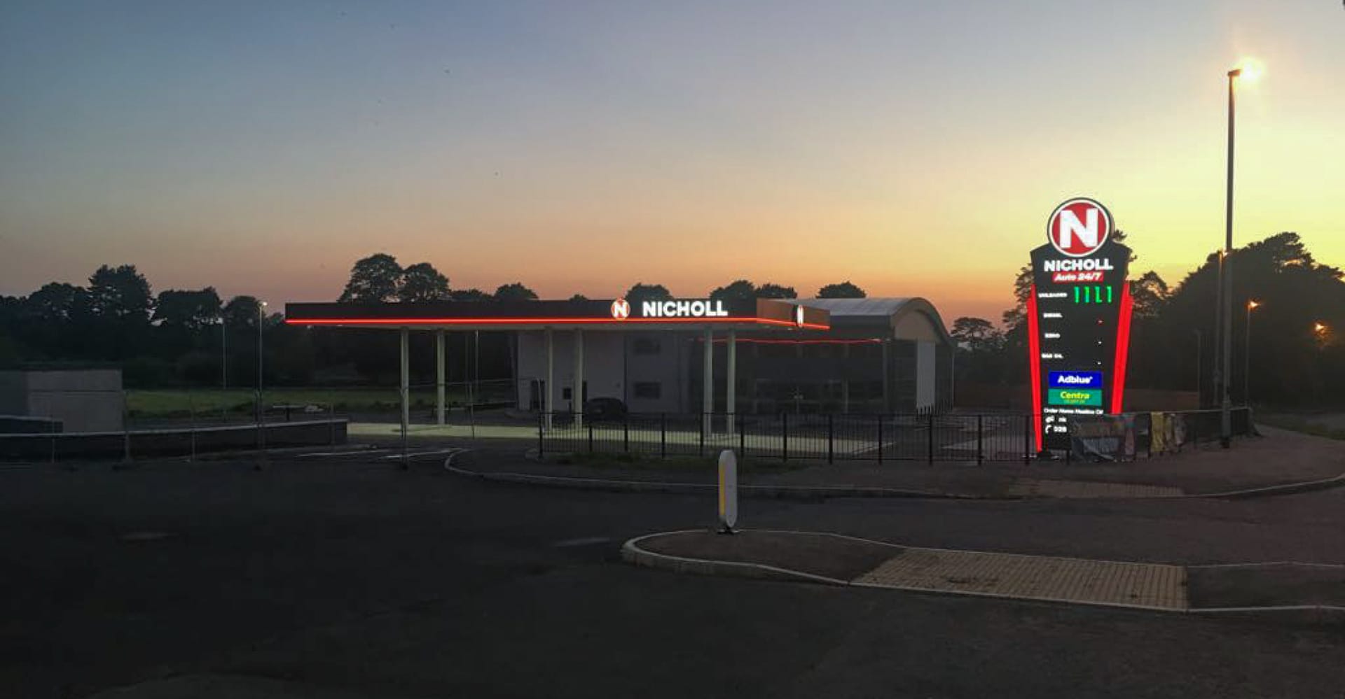
We created large white 3D illuminated LED lettering for the logo which was placed around the forecourt shelter. This area is perfect for displaying the company logo as it is in view for all potential customers. We pride ourselves on the methods we use to ensure precision when fitting our signage products. This helps to blend the signage perfectly with the surrounding building and features. Nicholl Oils wanted the branding to flow through the premises, so we decided to create graphics for the fuel pump areas. We covered the fuel pumps with the Nicholl Oils branding which adds a corporate feel to a once ordinary pump. We also created wayfinding style signage to show users how to pay at the pump. This signage protrudes from the side of the fuel pump and helps to transform the area.
A bespoke totem sign was created at the roadside, it displays the fuel prices along with contact details and the company logo. This totem shape differs from a standard rectangle totem which helps to make it stand out.


