Harry Corry signage Strand road
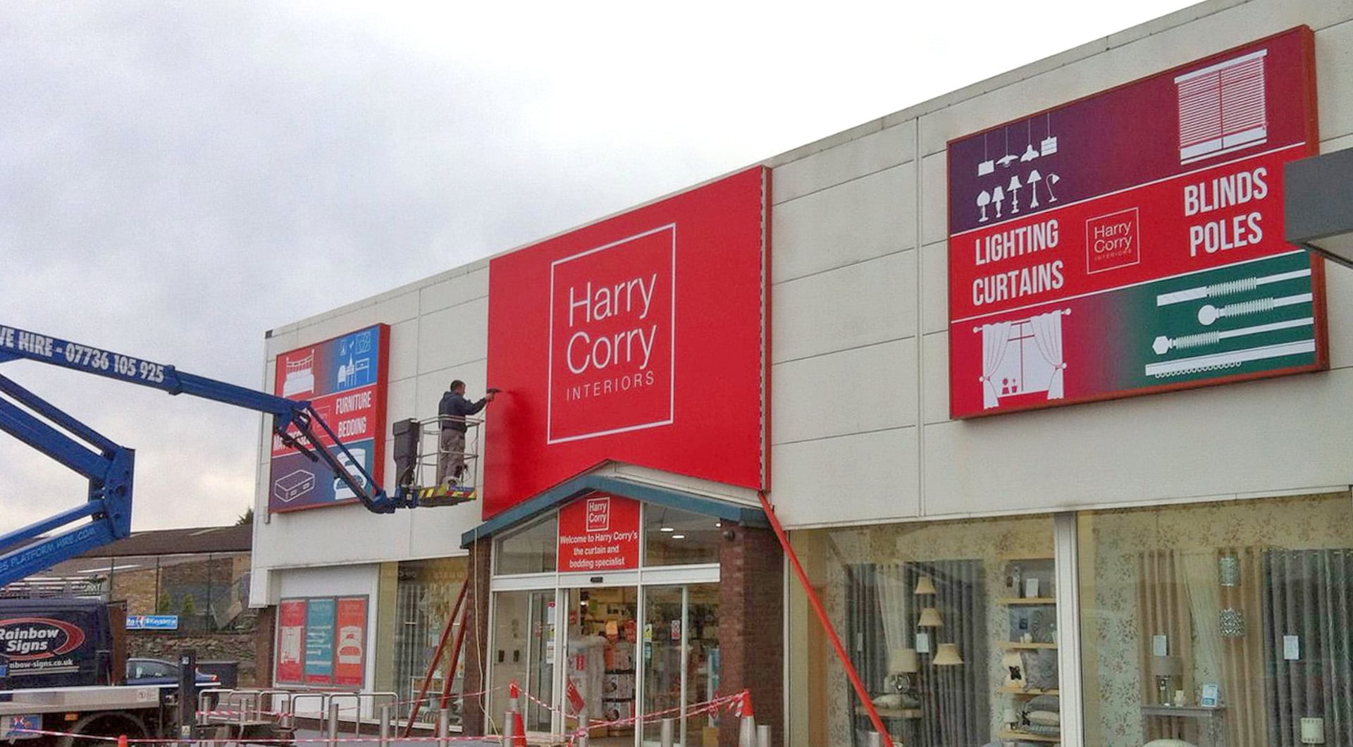
We recently carried out a signage job for Harry Corry, Strand Road in Derry/Londonderry. Here at Rainbow signs, we have been working with a number of the Harry Corry Interiors stores. They recently came to us in need of a brand update.
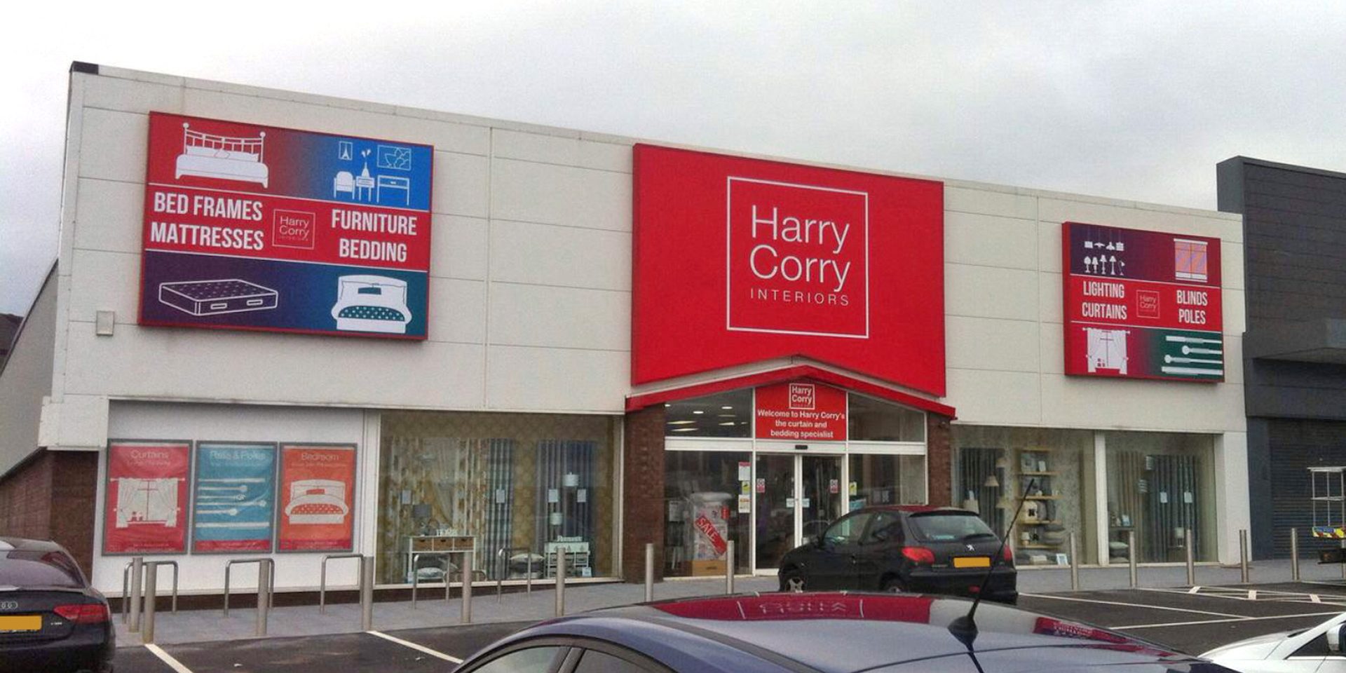
Our design team drafted a brand proposal with various design options. We knew Harry Corry wanted to stay close to their original brand but wanted to modernise it a little. Keeping the recognised red background colour helped to keep the logo recognisable. We changed the font from a serif to a sans serif, which gives the brand more of a contemporary appearance.

The signage for the Strand Road store was in need of a refurbishment. Their old signage was tired and looked drained of life. Thankfully we were able to rectify this by creating new vibrant fascia signage. Using our state of the art printing facilities we created a collection of stunning signage for the company.
We made use of previous signage layout and kept this so that the store could maximise their advertising potential. Either side of the branding above the entrance shows two large shoebox lid signs which are perfect for advertising. This boxes can act as personal billboards for the store, and also help to bring a bit of life to the plain exterior. These evenly spaced boxes works well to create symmetry, which in turn makes it more appealing to the target audience. Previously these boxes contained images related to Harry Corry but they lacked pizzazz. The new vector artwork images in these boxes are much more effective than the previous imagery used.
If your signage is in need of a face lift don’t hesitate to get in touch today. Start your signage revamp with the team here at Rainbow Signs.


